My new idea!

Hey there Onlooker, CreativeCookie here and today’s post is about my improvements to my storyline.

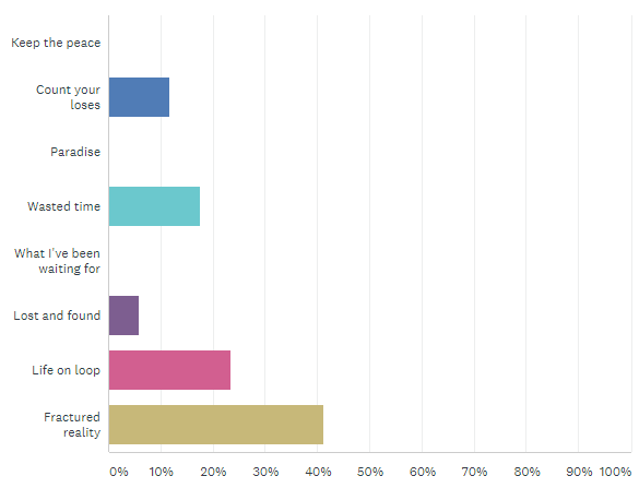
Before it was about a boy, Jackson, whose dad left him at a young age and took his younger sister. He then found her in the game in the form of a skull. She has an illness and will die. I did a survey to see if my focus group liked or disliked my ancillaries and film first drafts. I have come up with a solution to help my audience understand my film more yet allow my narrative to still be unexpected.

My new idea:

20180103_1600571.jpg

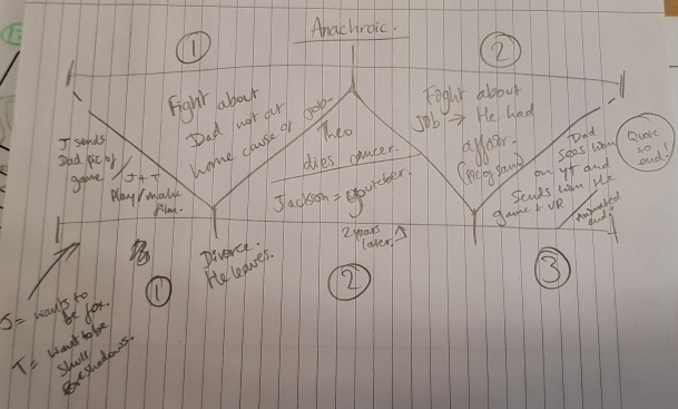
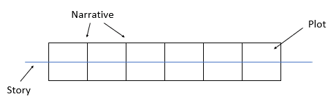
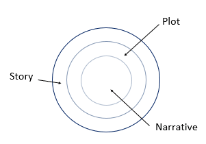
It looks complex but now I have changed my episodic anti narrative to a anachroic on, it makes it easier to understand overall. Ok, lets break things down…what have 5 parts. The parts above we will call A1 and A2, the parts below will be S1, S2 and S3. A=Anachronic / S=Storyline.

S1 – The start of the film. 2 boys, Jackson and Theo want are bestfriends and make films together. They want to get a new game (which I haven’t titled yet). Jackson wants to play the fox character and Theo wants to be the skull. The forshadows his death later on. Jackson sends his dad a picture of the game, he respondes telling Jackson he needs o grow up. His dad leaves following the divorce.

A1 – The dad and the mum are fighting because the dad is a workaholic and rarely comes home.

S2 – 2 years have past, in that time Theo died of cancer and Jackson becomes a youtuber to keep Theo’s legacy and dream alive.

A2 – The fight continues. We discover he has been having an affair. The end shot is of Jackson in a picture frame. This connotes they are his parents.

S3 – The dad sees Jackson’s youtube channel and sends him his favourite game in a VR form, with a note. Jackson enters the VR world.

I feel this idea has more of a moral behind the story. To reinforce this I my put a quote after my credits saying something like – ‘Never give up, no matter how hard thing get’.

My influences for this storyline are:

  • Wreck it Ralph – The girl is the glitch in the game.
  • My mum – She fought off cancer, so I can use my experience to show thought in the acting.
  • My dad – He is known as ‘the dream crusher’, giving the dad a reason to leave in my film makes the note he left more easy to understand.
  • Goldbergs – A TV show about a boy who makes films with his friends.

To create this idea, I will add a lot more scenes before and after the footage I already have. It’s not refilming, it’s adding to my already existing footage. This new storyline will defiantly extend my film and give an all around better understanding of the morals and narrative.


Feedback draft 1

Hey there Onlooker, CreativeCookie here and today’s post is about the feedback I received from my focus group.

This is act 1 and 2 of my film. What do you think need improvements in my first draft?

‘I think that understanding needs to be more clear, about how the characters with the masks fit into the production. I like how they are used but I just don’t understand how they fit, looks like two different productions’

‘I think some of the edits need to be changed to make the narrative and understanding of the two sections clearer and flow better’

‘I am a little confused about the storyline, maybe make this a bit more clearer for the audience’ / ‘The storyline of act two is unclear. Is the character dying within the game?’

‘When he goes into the game I think you should give the game more structure’

What is your favourite element of the film so far?

‘I like the variety of shots used’ / ‘Variety of shots’

‘I like the editing of the second half as it distinguishes the reality for the virtual reality well. I also love the masks in these section as they look very creative’

‘I really like the creativity of the virtual reality game in reality’

‘The editing of the forest scene’

What do you like most about my poster draft 1?

‘I like how you have played out the images to be in either side of the poster. You have created a good focal point for you information which means the audience will read the text’

‘Both characters with the masks on are used so the audience knows they are coming in the film. And I like how the background fits with the grey and the blue’

‘The font is very creative and corresponds with your theme’ /
‘The computer video game like text’
‘The glitch effect relates massively to the film and gaming’

‘Its simple and not crowded’

What do you dislike about my poster?

‘The bottom of the skull should be more faded’

‘It should include a tagline’

‘Positioning of text’

‘The image of the villain looks a bit out of place in comparison to the magazine’

What do you like most about my magazine draft 1?

‘I like the use of synergy as it it similar to the other ancillary text’ / ‘You can clearly see the resemblance between the poster and the magazine with could serve as an iconic factor for your audience’

‘I like the typography you have used as it fits well with the video game element of your film’

‘The position in characters as it shows the juxtaposition in characters’

‘Size of images’

What do you dislike about my about my magazine?

‘How it is different to what I would usually expect the text to be laid out’ / ‘There is not much to tell the audience that it is a magazine’ / ‘Is unconventional, confused how you are going to display the text’

Which title do you feel is best for this film?

Feedback film name

Any overall comments you have to help would be great!

‘It isnt really clear what is happening’ / ‘You could make the overall film longer and the narrative clearer’

‘Explore the father and sons relationship before, to add more background to the son’
Overall, this feedback is very helpful! I think my story line needs to be adjusted to fit the audiences understanding.

Story, plot and narrative

Hey there Onlooker, CreativeCookie here and today’s post is about story, plot and narrative.

Often people get confused when it comes to which is which. I didn’t really learn the difference until recently. Now I know the difference I feel I can have a better understanding of my film.

Story: Is basically the whole thing.

Plot: It is the events being shown.

Narrative: Is the order the events are shown in, the structure of the plot with in the story.

NSP post help

The diagram above shows the parts of a film and how they are different, not the same. If this is a bit confusing look at the one below. Basically, story is the biggest part going down to plot, then the smallest narrative.

nsp-post-help1.png


First draft

Hey there Onlooker, CreativeCookie here and today’s post is about my first draft!

Unfortunately, it is no where near long enough. Here are some other changes that I need to make that I know I need to get done:

  • Colour correction
  • Add glitch effect
  • Slow down animation
  • Title name
  • Keyframes
  • Add film and add the rest of my film!

So far, I am happy with. I was really scared of premier pro at first…but to be honest it was easier than I was expected. (Amazing new coming from a computer hater like me!) I never even thought I could have made a successful stop animation, but I have! 🙂

Logo design

Hey there Onlooker, CreativeCookie here and today’s post is about my logo.

logo-2.png

logo-3.png

I filled the two pages above with any ideas I had for my logo. Mt favourite ones include eyes. If not for sight, my film would be be pointless. I want my logo to link to my title.

Logo 4
I drew this logo when I was listening to ‘Rise up’ by Andra Day. Mountains are what I see when I here the song. The title would go in the banner.
logo-5.png
One of my title ideas ‘virtual, voiceless, voyager’ hence the 3 V’s. This logo design was inspired by the game ‘papers please’. Just the vibe of the game made me think of this.
Logo
This logo I drew as it looks like a heart, following my heartbeat productions. The bigger piece is to represent the skull and the smaller piece is the fox.


Screen Shot 2017-12-08 at 10.23.26.png

This is my first attempt at making a planet inspired eye logo. I will hopefully use Sam’s eye instead of a random one from the internet.

Mock ups

Hey there Onlooker, CreativeCookie here and today’s post is about my mock ups for my ancillary texts.

I drew 4 poster ideas and 4 magazine ideas, this was to ensure I had a broad range of ideas to work from. I picked 2 of each to narrow it down. Screen Shot 2017-12-05 at 10.55.39

  • 1 – I like it as it follows the layout of a magazine page I analysed called ‘The Godfather’. The only difference in my magazine layout the text is better than the image, the opposite to the ‘The Godfather’.
  • 2 – This is my favourite layout. It is symmetrical and links to my geo theme, as geometry follows symmetry.
  • 3 – I like the layout but I feel it is over completed and does not reflect my films style.
  • 4 – I quite like this design. It is very unique as the angle really offsets the fact it is a review. However, trying to write text in a triangular format will be impractical.Screen Shot 2017-12-05 at 10.55.51
  • 1 – This design is my favourite. It is the one that I instantly pictured for my film since the start.
  • 2 – I like this design. However, I think it is the weird version of number 1.
  • 3 – I quite like this design but my photoshop skills are limited so going ahead with this design might be a challenge and look really bad as an end product.
  • 4 – I like how this design shows the people behind the characters. It is a contender to try and beat number 1.
Screen Shot 2017-12-05 at 10.57.08
Magazine 2


Screen Shot 2017-12-05 at 10.57.21 1
Magazine 4
Screen Shot 2017-12-05 at 10.56.53
Poster 1
Screen Shot 2017-12-05 at 10.56.38
Poster 4
Screen Shot 2017-12-05 at 19.12.01
Poster 1

This is the first draft of my poster. I need to fade out the bottom of the skull character and fill in the text. I have chosen this layout as it looks as if the skull is behind or following the fox, which happens in the film.

Screen Shot 2017-12-05 at 19.12.27 copy
Magazine 2

This is the first draft of my poster. I like how the blue is behind the fox and the grey behind the skull. To me, blue denotes the sky but connotes happiness, the characteristics of the fox. Grey denotes ash but connotes death, the characteristics of the skull. I also made the skull bigger than the fox, to connote he is stronger than her.

I love how they both look linked. The aesthetic of both the poster and magazine are quite similar, giving me a house style.